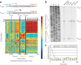
Unstandardized chloropleth maps have no assigned order or specific rank in displaying data. Here are Unstandardized coefficients for structural equation model in different years.
Search This Blog
Tuesday, November 30, 2010
Standardized choropleth maps
Standardized Chloropleth maps to allow comparison of distribution among different areas. Here is a standardized map showing water quantity.
Univariate choropleth maps
A univariate map displays a single data set. The example above is a 1904 map showing housing conditions in Manchester and Salford
Monday, November 29, 2010
Bilateral Graph
A bilateral graph is usually a visualization map, comparing two related variables are identified as well as their overlapping data. The example above displays Japans Corporations Environmental ODA.
Sunday, November 28, 2010
Accumulative Line Graph
Depicts two data sets usually in the form of a graph. This 21st century example compares four different data sets of apple appliances.
DLG
(GIS) DLG are Digital Line Graphs. These data files contain vector information and cartographic representations. Above is data from Sydney, Australia.
Isotach Maps
Usually dealing with meteorology, these maps measure wind speed across a region. As you can see the lines above (contour) connect points of equal wind speeds.
Isopach Map
An isopach map is a map illustrating variation of thickness within a tabular unit or stratum. These maps usually show equal thickness over an area.
Isohyets
Very detrimental in rainfal prediction and stats, Isohyets connects points on a map that hasve the same amount of rainfall in a giving time period. This example depicts rainfall during the month of July in 2008.
Isoline Maps
As oppose to other "Iso" maps, An Isoline map is one that connects continuous points of the same value. This example shows mobile phone reception in a particular region.
Isobars
An Isobar has numerous different meanings depending on the topic. This particular example depicts a line connecting points of equal atmospheric pressures.
Sunday, November 14, 2010
Similarity matrix
A similarity matrix express the similarity between two data points. This example categorizes common behavior patterns under one forensic model.
Cartographic animations
These animations are relevant in cartographic features. Defined as visual representations that occur over different periods of time. These images record change over time by displaying new maps for each year.
Bivariate choropleth
Bivariate choropleth maps compare two related variables, within different years. The example above displays raw freedom scores in the Philippines over multiple years
Propaganda maps
Some argue that propaganda maps are false, and not accurate. Usually depicting times of war these maps display geographical information. This particular map fulfills its purpose in satisfying a countries patriotic needs.
Isopleths
Example above displays measurements of radial velocities in clusters of galaxies. Isopleths are contour lines that simplify data with continuous distribution.
Parallel coordinate graph
Parallel coordinate graphs are one of the many graphs that display multidimensional data. This is a view of cells and nine different cell genes.
Tuesday, November 9, 2010
Climograph
Climographs are graphical depictions of the monthly precipitation and temperature conditions for a selected place or region. Here is an example of a climograph from both California and Kansas.
Histogram
A histogram displays a visual impression of the distribution of experimental data. Above is a typical example of how a histogram is set up.
Cartograms
A cartogram is distorted in order to convey the information of this alternate variable. There are two main types which are area and distance cartograms. Here is a cartogram depicting endangered species within specific countries.
Bilateral graph
A bilateral graph depicts increases on one side of a zero line and a decreases on the other side of the line. Bilateral graphs are used to display data when there is both positive and negative values.Here is an example of bilateral graph displaying Gender and Cataract surgery between Males and Females
Sunday, November 7, 2010
Lorenz Curve
A lorenz curve represents distribution. Usually income, this Lorenz Curve represents data from a household income survey.
Index value plot
Yet another visualization map, a index value plot, it is data plotted on a line graph. Although this set of data is not, it is usually paired with a chart or list for reference points
Wind Rose
A Wind Rose is a graphic tool/map that is used by meteorologists to determine wind speed and direction. The Data is usually taken in a particular location; this example is just a general depiction of the map.
Correlation Matrix

Defined as Non specified class of statistical relationships between two or more random variables or observed data values. This example is a correlation matrix displaying some cell cycle data.
Star Plot
A star plot is a graphical data analysis technique for examining the relative behavior of all variables in a differebt variable data set (Each spoke representing a dfferent variable). This one particular anlayzis buicks in 1979.
Cartisan Map
Cartographic maps focus on custom maps and GIS solutions. This is a cartography map displaying electoral votes throughout the country.
Proportional Map Circles
Proportional map circles are usually used by travel agencies to link locations for tourist. This is an example of Europe Lab Circles, linking individual countries throughout the continent.
Infrared Maps
Infrared maps are aerial visuals typically used to track weather changes. This particular picture is linked to the air force and is a over view of a region in East Africa.
Friday, November 5, 2010
Black and White Aerial
This is a form of Infared photography. This form of mapping is used to block out all forms of light.
DRG
This map is known as a Digital Raster Graphic. It is a scanned image of a U.S geological survey.
PLSS
The Public Land Survey System (PLSS). This is a method used in the United States to survey and identify land parcels.
Thursday, November 4, 2010
Scatter Plot
A Scatter plot is a map mainly utilized in mathematics. It is used to value two variables for a particular set of data.
Population Profile
A population profile shows a number of people as a function of their age. This particular chart ranges from individuals up to age eighty.
LIDAR
Using elevation points, LIDAR data are very detailed. As shown above, are usually used to show detail topographic features.
Triangular Plot

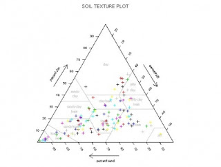
This is an example of a triangular plot; one that displays data and information in the shape of a triangle. This particular example is a plot displaying textures.
Box Plot
A box plot is a map that can depict numerical and graphical data. Above is a box plot depicting data from a scientific study.
Subscribe to:
Comments (Atom)


